The advantage of a fluid inline-block strategy to display product thumbnails is that the thumbnails will arrange themselves according to the screen size.
The drawback is that, if the images have various widths, their alignment will be completely jagged on a mobile display. In case the height varies, they will be jagged in large screen too, so it requires to use standard width and height. The length of the product name can also be a problem, pushing the next product card to the line below. For that reason, you want to have media query so that the card takes 80% of the width of the screen on the smallest screen size to have your products display on one column.
Last drawback for which I don’t have a solution yet is centering. The inline-block div will align left and if there is a gap on the right that is even one pixel too small for the next card, the space will be left blank. It’s up to you if you consider this acceptable or not.
Grid system
A grid system allows to keep everything nicely organized. The drawback is, for it to work, you will have to set break points to change your grid organization depending of the screen size. The number of screen size available on the market is already quite large and you want to check how your page will look on various display (first and foremost the most popular ones). But there will be new ratio of screen display coming up in the market that will be in between your existing break point and might break your carefully crafted design.
To avoid this issue, I style the website starting from the smallest screen currently on the market and then I use the “responsive” feature of the dev tool and change the screen size until the design “breaks”. That’s where I set my new break point and implement new rules.
All is perfect in the best possible world you would say, but I actually also like to use bootstrap framework and it has breakpoints on its own.
And if you are using other CSS framework they also comes with their own breakpoints and they might fit so well the latest device on the market, same if you use a theme you have not developped etc.
Normalize the width on your pictures. If slightly different picture width won’t look bad on a large screen, due to the width of the div being larger than the width of the picture, the picture grid might be completely jagged on a mobile display simply because the width of the div is not large enough to compensate for variation in the width of the pictures. That looks terrible. One reason you might want to have thumbnails of different width is when you have picture representing object of the same height but of different width. If you set the width to be the same on both type of object, the larger one might appear smaller (if you keep its proportion right, reducing its width will also reduce the heighth of the picture). It is not really desirable.
One colum display on small mobile screen
The second option that is used by most webshop is to switch to a one column display when the screen size goes below a certain point. That seems a sensible decision. The draw back is that you have to scroll through more “screens” to view all the products but at least you don’t have to dwarf large products compare to slim one or worse, have a completely jagged display.
Lazyload
Lazyload your picture, there are easy to use framework and the code is not difficult to implement.
Use large, high definition product pictures on product page
If you have an online store, people will want to check the product in detail: they will want to see the texture, the finish on the edges. Is it sharp or bezeled? etc. So give as much freedom as possible to your user to zoom in and look around your products, by having pictures of the product with different angles and zoom in some details.
Use webp
There are excellent solution available to serve webp to supporting browser without bothering with javascript. I recommend the Webp Express plugin for wordpress and webp on demand. For more options you can check my article on serving webp and jpeg2000.
In a nutshell: Look for .navbar-toggle and change the media query in which it lives. @media (max-width: 768px) Here you can input the value at which you want your menu to change from mobile to desktop.
At the time this article was written, if you include some external file in a page using PHP and that file starts with a BOM, it may create blank lines.
This is because the BOM is not stripped before inclusion into the page, and acts like a character occupying a line of text. See an example. In the example, a blank line containing the BOM appears above the first item of included text.
Prepare your css sheet in an image editor. The final format will be in png to keep your images as sharp as possible, webp is also a good candidate if you take care of the brower support.
When laying out your images on the css sprite image, make sure to use consistent spacing between the images. It will help when styling your sheet and keeping it minimal.
You indicate the size of the portion of the picture of the sprite you want to show in the css code. If you want to reuse the height and width of your styling as much as possible, make sure that the image are at least height and width apart from each other (measure from their top left corner as this is the coordinate you will use to display the proper part of the CSS sprites.
Note that this is a cylinder system of coordinate which means if the height you set is larger than the height left between the top left corner of your image and the bottom of the sprite sheet, the remnant will be carried over at the top of the sprite and everything within that value will be displayed. In other words, the sprite repeats itself until it covers the entire height you set.
It works in a similar pattern for the width.
As mentioned above, you indicate what part of the sprite to display by entering the coordinate of the top left corner of your image on the sprite. The top left corner of the sprite is the origin of the coordinate system. Along the top of your image you will have the y axis and along the left side of your image you will have the x axis. So every point in your image will have negative coordinate.
I choosed x and y, because the coordinate along the height of the image will be entered first while the coordinate along the width, second. This match the usual (x,y) way of representing 2D coordinate so that’s why I use this terminology.
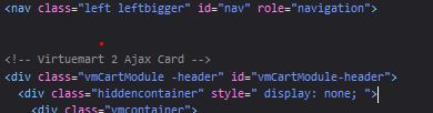
Flexbox is perfect to manage nice and responsive layout in modern browser. Let’s see how we can integrate it with horme 3 template for virtuemart, together with lazyloading.
Our first implementation does not give desirable result.
The issue is that there is only 3 items per row, leaving an empty column. The add to cart button seems to go all over the place as soon as the third row is reached.
The add to cart button need to be pushed at the bottom of the div. It seems the div height change depending on the scrolling. Everything is fine when the css load but if scrolling down then up, then the div might be displayed with a “too short” height, hiding the add to cart button in the process.
Google insists on serving images at the right size using srcset. It has two advantages, the first one is that the page render faster ( as the picture does not have to be resized by the browser to be displayed, if I understand correctly) and that the content in the page does not jump around when the picture is rendered in the browser.
Avoiding content bouncing around when page is rendered
To avoid bad user experience while your page is rendered on the user browser, namely, to avoid your content position being recalculated when the image is loaded, you have two options: one is to set the image width and height in the style and the other, in case of lazyloading is to load a placeholder of the appropriate size in place of the picture. If you are using pictures of a standard size in your page, you justhave to load the picture once to be all set. Both technics are easy to implement.
When setting the width and height of the picture in CSS, you can then serve a larger image to accomodate high dpi screen. Although it leads to a better user experience in terms of quality of image, at the expense of a some milliseconds rendering, google page speeds insight will penalize the practice in its scoring system.
The team at google does not specify why they are so insistant on this. It is a benefit for the user and for the webmaster as the user experience improves but I assume the guys at google might have a special interest in this.
Actually one example they are using to illustrate the consequence of not using properly sized picture is when the user go to click on a link on a page and an image starts rendering, pushing the content down and leading the user to click on whatever was pushed where is mouse or finger landed. The new place being potentially a google ad. On top of a bad user experience, this “practice”, be it volontary or not lead to bad quality trafic to google ad, and I assume this drag the price of google ad clicks down.
Of course google wants to promote quality sites that provide quality user experience, but I don’t see them insisting that much on other practices so I suspect there should be an extra catch here.
As an example of practices leading to bad user experience is the sudden trend there was in web design to display images that slowly, almost imperceptibly zoom in. It can be onload, or on mouse over, etc. I understand the desire to make the page dynamic and modern by displaying sleek animation but the fact is that it gives the sensation of vertigo and unease (think about how you create this sensation in a movie for instance, that’s what you gonna use).
So you are using javascript, load time, etc and gives your user the feeling he is sick and needs to take a break from computer right now. But he won’t be clicking inadvertantly on Google ad so that’s ok.
[EDIT: it seems this nonsense trend has already faded to oblivion. ]
The number one take away is to have a light weight website that is mobile friendly.
We have covered some of the very important topic in previous articles about optimization so we will focus here on the surprise features and highlight some point we have skipped previously.
Schema markup for rich results
One of the topic I didn’t cover so far is schema markup for rich results. Google likes it as it allow its search engine to extract the useful information from your page and display that on their search resuls. One can ponder why we should provide content for Google. There is the hope of figuring prominenttly and rank higher but if people get their answer directly from the search page, what economical model do you have left to make money from your website, unless you are paid directly by google. That would be the case for a recipe site.
One thing that has been highlighted in the talk is that schema information might be used with assistive technology, to walk you through a recipe for instance.
Concerning product page, if you are competitive, you might attract customer with your super price or the super brands you have available at your store.
So that’s the two core benefits you can expect from product mark-up. Event mark up might actually be useful to provide straight from the search information about your live event with clear information for google about when the information will be out of date. Leading for a better user experience, unlike the recipe case where you don’t really your recipe to be displayed directly on search page unless you got some compensation from Google for using your content.
For product markup, in sector where negotiation is important, you might not want to have any kind of price displayed publicly to avoid giving any cue to your competitors and allow you larger freedom regarding your pricing. For instance the price might largely vary depending on the quantity of a single item or the total amount of the order due to saving on scale, distance , options, it would be a daunting task to give all available options and integrate all factors influencing the final price and integrate that in a schema markup, plus as seen above it is totally counter productive in terms of conversion as your competition would only have to check your site to propose a more competitive offer.
Needless to say that all schema markup are not made equal and you might consider the benefit of implementing specific schema markup depending on your activity.
Users like large, high definition images
Google aknowledge that people like large, high definition images and will feature those images in their search.
Using proper compression will help reduce the bandwidth necessary to load the image.