Issue: No results come when searching for product tag in woocommerce.
Solution: For me the issue was solved after declaring woocommerce support in the theme. Check our article on how to declare woocommerce support in your theme.
Issue: No results come when searching for product tag in woocommerce.
Solution: For me the issue was solved after declaring woocommerce support in the theme. Check our article on how to declare woocommerce support in your theme.
Issue: the woocommerce price filter is not working.
Solution: The issue is likely due to a compatibility issue with your theme. To solve that, you will need to declare the theme woocommerce support and copy your page.php file content to a new file that you will call woocommerce.php. You will replace the loop by <?php woocommerce_content(); ?>.
You will also need to make sure woocommerce support is declared in your theme functions.php: add_theme_support( 'woocommerce' );
For more info on woocommerce theme development and support:
Issue: The sidebar and by extension the sidebar widgets are not showing on your product tag page on your woocommerce site.
Solution: While investigating this issue I have come accross many suggestion to use the widget-logic plugin to solve this issue. Chances are that it won’t help as some code is preventing your sidebar to show on the product_tag page.
Check your page.php template. It might have condition checking if the page is a woocomerce category page or the shop page for better control .
Check if your template has a woocommerce.php file, if it doesn’t look for the page.php file.
Check for a condition such as
if (is_product_category()||is_shop() )
Check that this control the display of the sidebar for example you might see:
get_sidebar()
If you find that the condition checking the page type call the sidebar, bingo, just add an extra condition so that the same code apply to your product-tag pages:
is_product_tag()
If you need to adapt the display for certain tag only you can use:
is_product_tag('tag_name')
To summarize in case you have condition controlling the call to the sidebar make sure to add the is_product_tag() function. In our example it would look like this:
if (is_product_category()||is_shop() || is_product_tag() )
The question mark in the middle of a php expression is a shorthand for a conditional statement and comes together with a column. Together they form a ternary operator.
isset($x)? $y:$z
The expression above evaluates to $y if isset($x) is true and to $z if it is false. Note that isset($x) can be any function method or variable returning a boolean.
You might have add difficulties to and errors when trying to add shortcode to new WordPress articles and posts.
To add a short code in the new editor, hover at the top center of an unactive block and click on the circled + icon that appears at its top center .
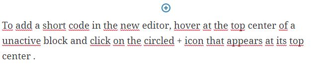
You can also click on the circled + icon at the top left corner of the page.
In the search bar type: shortcode
Click on the shortcode option. A new block will be added.
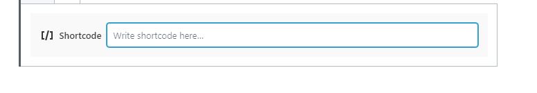
Type in your shortcode as you would do in the classic view:
[ShortCodeTag]
Note: I did encounter an error that the page couldn’t be saved when trying to save the page with the square brackets in WordPress 5.2.4. It turned out that the page was actually saved. This issue was supposed to be fixed already since 3.9 see github repo for wordpress gutenberg.
You might have noticed that virtuemart date format for the “Product Available Date” notice is in US format (at least for my install). This format (YYYY-MM-DD) is a bit confusing in countries where the standard is different, for instance the standard in Europe is DD-MM-YYYY.
Now we will attempt to display this product available date in our choosen standard.
In com_virtuemart/product/details/default.php, you can see that the part controlling the display of the product availability date is stockhandel.php in sublayouts
By consulting this file you can quickly locate the variable for the product availabity date string followed by the variable for the date string: DATE_FORMAT_LC4
Now that we have this information we can go in Extensions -> Languages->overrides
select your front end language on the drop down menu. Enter the variable and in text enter the date format you want to use.
A user friendly format might be: j F yy
This will yield a date in this format: 28 February 2020
The advantage of a fluid inline-block strategy to display product thumbnails is that the thumbnails will arrange themselves according to the screen size.
The drawback is that, if the images have various widths, their alignment will be completely jagged on a mobile display. In case the height varies, they will be jagged in large screen too, so it requires to use standard width and height. The length of the product name can also be a problem, pushing the next product card to the line below. For that reason, you want to have media query so that the card takes 80% of the width of the screen on the smallest screen size to have your products display on one column.
Last drawback for which I don’t have a solution yet is centering. The inline-block div will align left and if there is a gap on the right that is even one pixel too small for the next card, the space will be left blank. It’s up to you if you consider this acceptable or not.
A grid system allows to keep everything nicely organized. The drawback is, for it to work, you will have to set break points to change your grid organization depending of the screen size. The number of screen size available on the market is already quite large and you want to check how your page will look on various display (first and foremost the most popular ones). But there will be new ratio of screen display coming up in the market that will be in between your existing break point and might break your carefully crafted design.
To avoid this issue, I style the website starting from the smallest screen currently on the market and then I use the “responsive” feature of the dev tool and change the screen size until the design “breaks”. That’s where I set my new break point and implement new rules.
All is perfect in the best possible world you would say, but I actually also like to use bootstrap framework and it has breakpoints on its own.
And if you are using other CSS framework they also comes with their own breakpoints and they might fit so well the latest device on the market, same if you use a theme you have not developped etc.
Another option is to use Flexbox.
Let’s summarize what we have seen regarding picture display:
Adapt the size of your picture by using souce set html element.
<picture>
 <source media="(min-width: 376px)" srcset="https://path/to/picture.jpg">
 <source media="(max-width: 375px)" srcset="https://path/to/picture.jpg">
 <img class="center" alt="alt text" src="https:// path/to/picture.jpg ">
</picture>
Normalize the width on your pictures. If slightly different picture width won’t look bad on a large screen, due to the width of the div being larger than the width of the picture, the picture grid might be completely jagged on a mobile display simply because the width of the div is not large enough to compensate for variation in the width of the pictures. That looks terrible. One reason you might want to have thumbnails of different width is when you have picture representing object of the same height but of different width. If you set the width to be the same on both type of object, the larger one might appear smaller (if you keep its proportion right, reducing its width will also reduce the heighth of the picture). It is not really desirable.
The second option that is used by most webshop is to switch to a one column display when the screen size goes below a certain point. That seems a sensible decision. The draw back is that you have to scroll through more “screens” to view all the products but at least you don’t have to dwarf large products compare to slim one or worse, have a completely jagged display.
Lazyload your picture, there are easy to use framework and the code is not difficult to implement.
If you have an online store, people will want to check the product in detail: they will want to see the texture, the finish on the edges. Is it sharp or bezeled? etc. So give as much freedom as possible to your user to zoom in and look around your products, by having pictures of the product with different angles and zoom in some details.
There are excellent solution available to serve webp to supporting browser without bothering with javascript. I recommend the Webp Express plugin for wordpress and webp on demand. For more options you can check my article on serving webp and jpeg2000.
There is an excellent article on coderwall.com on the topic already:
https://coderwall.com/p/wpjw4w/change-the-bootstrap-navbar-breakpoint
In a nutshell: Look for .navbar-toggle and change the media query in which it lives. @media (max-width: 768px) Here you can input the value at which you want your menu to change from mobile to desktop.
Recommended reading:
https://httpd.apache.org/docs/2.4/logs.html
A typical access log structure looks as follow
LogFormat "%h %l %u %t \"%r\" %>s %b" common
CustomLog logs/access_log common
%h: IP of the visitor (it might be a VPN IP for instance).
%l RFC 1413 identity of the client (not check unless IdentityCheck set to On). Highly unreliable.
%u user id. If the document is not password protected, the value will be set to – as above.
%t The time the request was received
\”%r\” Request that the server received, between double quote. It starts with the method, then the requested resource, then the protocol (e.g. HTTP/2.0)
%>s The status code that the server sends back to the client
%b size of the object returned byt the server to the client.
Example:
213.18X.X.XXX – – [11/Oct/2019:11:52:08 +0300] “GET /index.phpXXXXXXX HTTP/2.0” 303 314 “https://example.com/” “Mozilla/5.0 (Windows NT 10.0; Win64; x64) AppleWebKit/537.36 (KHTML, like Gecko) Chrome/77.0.3865.90 Safari/537.36” (38FF183F-0.107)
You can see the two dash represented the fact that, for the first dash, the RFC 1413 identity is not used, and for the second, that the resource is public and no identification is requested.
Here you can see there are extra info after the size of the object returned. This indicates the server is using combined log format which goes as follow:
"%h %l %u %t \"%r\" %>s %b \"%{Referer}i\" \"%{User-agent}i\""
\”%{Referer}i\” being the referer (e.g. a link to your site on another web site or a form with a POST action to your server)
\”%{User-agent}i\” the user agent (e.g. the browser specification used to navigate your site)
In a more readable way, you will often see your access log as follow:
IP – – [DATE and TIME] “METHOD /URLREQUESTED PROTOCOL” SERVER_RESPONSE_CODE OBJECT_SIZE “REFERER_URL” “USER_AGENT”